Saturday, April 21, 2012

Scrapbook Circle April 2012 Sketch Challenge

I've been a member of Scrapbook Circle for the last few months and I couldn't be happier with their kits. They are so well put together and include the newest and best scrapbooking supplies. I seriously get so happy when the kit arrives each month. They have a great blog too, with lots of ideas, inspiration, and challenges.

One of the challenges each month is a sketch challenge. They post a sketch and then challenge you to create a layout with the monthly kit. So, this is the first month I've participated. The Daydreamer kit is a very fun kit with lot of bright colors and ledger papers, perfect for fun and happy layouts.

Here's the layout I created of my sweet boys way back in 2006, not even three years old yet.


I love the bright, fun colors. For the title, I used some American Crafts Thickers from my stash. The tag behind the title is also from my stash but not sure where I originally got it. I used a color mist from October Afternoon - Comet Tail orange - to color the Heidi Swapp banner and to add some drops of color to the background paper. The journaling spot is die cut from Spellbinders Nestabilities Labels One.


I'll be sharing this layout with the Scrapbook Circle blog for their challenge too. Thanks for looking!

Thursday, April 19, 2012

Window Card

My first ever window card. I'm very excited about this card. I've been making handmade cards for the last year for most everyone's birthdays but mostly from kits. But this one is a Lissa-original at least in that I picked out all the pieces. :) The card design itself is from an awesome card class I'm taking right now that focuses on die cutting machines - manual and digital - and was so excited after watching today's videos that I had to immediately make a card.


If you are interested in card-making, you have to check out the A Cut Above class from Online Card Classes. It's been amazing and I'm only on day 2. I've already learned some huge tips for using my die cutting machines that have made it super fun to use my dies again.


I used the Spellbinders Nestabilities Labels Eight die set with Basic Grey Skate Shoppe papers and a few other leftover blue paper scraps. I added a little circle embellishment with punched hearts. The inside has a little sentiment I printed off (font is SNF Miss Molly), die cut, then mounted on another little nested label. I then misted the whole card - after masking off the inside - with dark blue and shimmer white paint.


Yay - love how it turned out. Thanks for looking!

Tuesday, April 17, 2012

Painted Bench

When I picked up this bench for $5 at a garage sale this past fall, it was not pretty. It had no seat and was covered in this textured flecked-stone spray paint.


But I saw the potential and brought it home anyway. Hubby added a seat, and the boys helped me sand (almost) all that flecked-stone paint off. It was a lot better.


But it wasn't quite finished yet. I painted it a light gray to start.


I then distressed the edges and stained it with a dark espresso stain (my first staining experience). It was lovely and perfect.


The dark stain changed the gray to a deeper, shadowy color that I just love.


The distressed dark edges really show up against the lighter gray.


It now sits on my front porch with the shabby blue chair, looking lovely.


I love how it turned out. My front porch is really coming together. Thanks for looking!

Linking up to these parties:


  :   Home Stories A2Z

Saturday, April 07, 2012

Shabby Blue Chair

I'm so in love with this project. This started out as an old wooden chair I picked up at a garage sale last fall for $5. It was wobbly and dirty and not pretty at all, but I saw the potential. I've seen lots of chair makeovers on Pinterest, and I knew I could make this one adorable.

Here's the original chair - you can see it's a pretty plain little chair under all that Halloween stuff.


It sat on my front porch all winter until the weather was finally warm enough in late March to tackle this project.

To paint the chair, I followed the process outlined in The Everygirl Handbook: Repainting Furniture by Kate Riley and in Creating Your Masterpiece by Shaunna West. Both are incredible resources for convincing me that I could do this. You should definitely pick up those e-books if you want to paint some furniture.

So, to start with, I sanded the chair down a bit, just to clean it up and get the rough spots off. The seat was cracked across the middle and one of the cross-pieces in the legs was out of line. So we filled in the crack with glue (just plain old Elmer's) and used a hammer to gently tap the legs back into place.


Hubby used his clamps to hold the seat together while the glue dried.


Now it was time for the fun part - painting. I picked out a nice robin's egg blue from Home Depot - Blue Feather by Behr. It went on very pastel-ish but dried a bit brighter, just what I was hoping for. I gave it 2 coats of paints. I let it dry overnight between coats.

Then it was time to distress it. I used a little square of sandpaper to knock the paint off the edges in strategic places. Shaunna's ebook really explains this well - and she has a few videos to go along with the written process. Very, very helpful. I had fun with the distressing part - I think it looks just right for what I wanted.


I didn't stain or glaze this chair after distressing. I just loved how it looked with the blue paint and the wood showing through a bit. So I rubbed a wax sealant on top to finish it off and put it out on the porch. When my boys saw the finished chair, Jack sorrowfully told me, "Um, Mom, I'm sorry to tell you that the paint is already coming off." I had to laugh and explain that's how I wanted it to be.


It looks super cute on my porch - it adds just a little touch color for spring. And it makes me happy every time I look at it. :)


Linking up to these parties:

I Heart Nap Time             

Tuesday, April 03, 2012

Reflections on Project Life

I just finished up my 2011 Project Life album. I love how it turned out. If you haven't seen the Project Life albums from Becky Higgins, you should definitely check them out. They really do make scrapbooking accessible for anyone.

I've done a Project Life album for 2010 and for 2011. And even though I love both of these albums, I'm not doing another Project Life album for 2012. I love the designs for this year - but I want to do other things with our photos.

So for now, I wanted to reflect on my experience with Project Life. I really love how the two albums I created capture the everyday of our family - the food, the places, the things we love. I was also able to capture the big events - the vacations, the birthday parties, the holidays. I love how I can see all of those things in a single album.

With my usual scrapbooking albums, the view of our year is broken up into whatever I can get done or printed. In the Project Life album, it's all there - and it's finished. My boys love to look through these two albums even more than the others I've made. They get excited to see all the people and events they remember. It makes me really good that I was able to accomplish and complete these two albums.

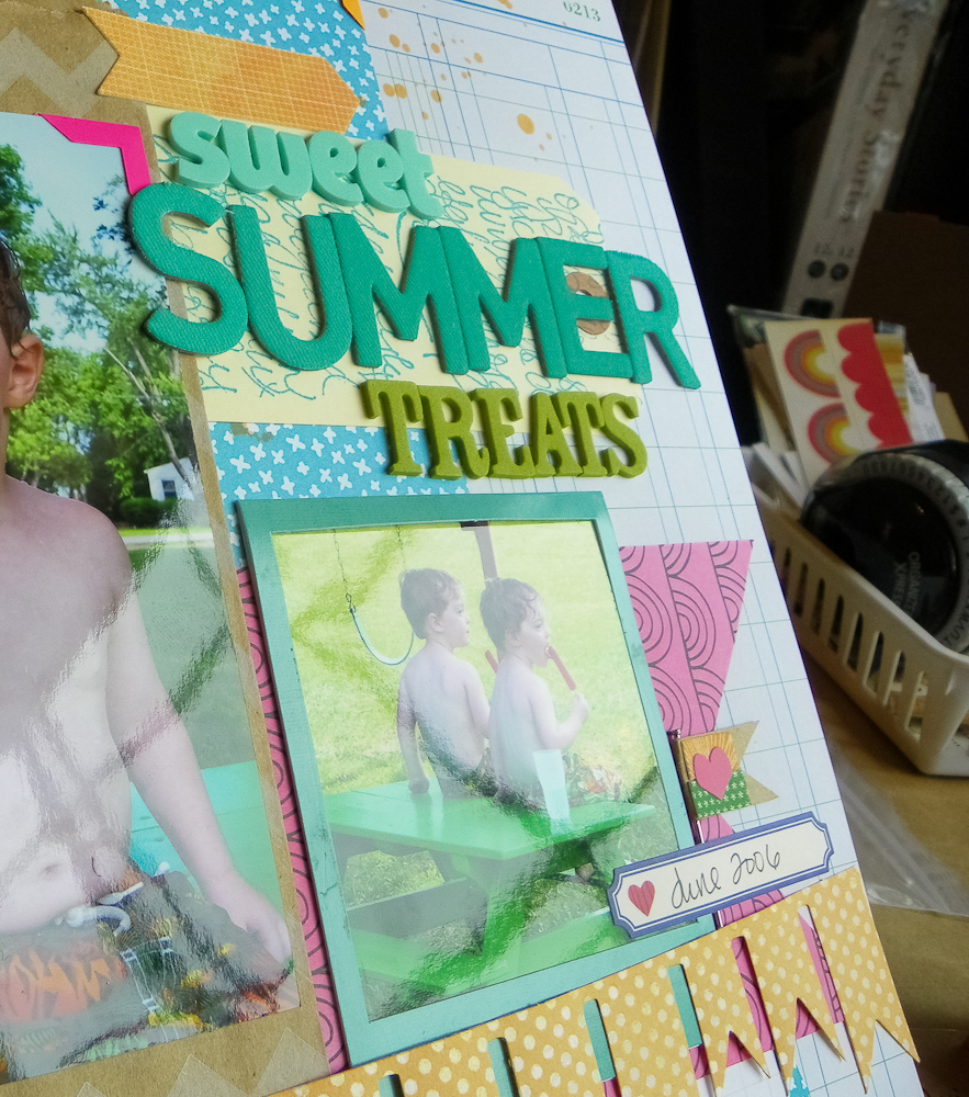
As I said, 2011 was the second year I did Project Life - and I cut myself a lot more slack than I did in the 2010 album. I think originally I was so excited about the album and the project of documenting our daily lives that I made it too hard. It looks very pretty...

2010 page


...but there were a few things I did that made it more of a chore than it should have been.

You can see first of all that I rounded all the corners on the photos. I originally wanted to do this so that they matched the paper inserts. It looks really nice - but it got extremely tedious by the 30th week or so. It seems like a tiny detail, but it was just one more thing that made me procrastinate about working on the album. And when I compare it to the 2011 album without any rounded photo corners, there's no noticeable difference for me.

2011 page


In the 2010 album, I labeled every photo with a day of the week. I didn't necessarily have a photo for every day of the week - but I thought it was important that I label them so that we knew which day of the week it was. I then labeled each journaling card for each corresponding photo. And that means, yes, I had a journaling card for every photo.


This was a really time-consuming idea. Now that it's two years later, I can tell you that I could care less on what day of the week the photo was taken. In my mind, the 2011 page without daily labels or journaling cards for each and every photo is just as wonderful as the 2010 page. Doing my pages in the 2010 way made so much more work of what should have been an easy project.

In the 2011 album, I didn't worry about having photos for each week. In fact, I did a single spread for some months. And I'm perfectly happy with that.

August 2011 page - 1 month on a single spread

Something else I didn't quite like in my 2010 album was that because I was doing only a single 2-page spread for each week, that meant I only allowed myself one or two photos for the big events like birthdays and vacations that fell in that week. But in my 2011 album, I let myself use a single spread for an event - and I was so much happier with that. It allowed me to use more photos from an event while still narrowing it down to just the photos that really captured the event.


Finally, I spent a bit of time putting the finishing touches on both albums by embellishing the title pages. I love how they turned out. I've seen so many great title pages for Project Life on Becky's site and on Pinterest, and I wanted to make something beautiful for our albums too. When I saw that other people were putting the embellishments on top of the divided page protector, it was a lightbulb moment for me. I love how it looks.

2010 Intro Page

2011 Intro Page

Overall, I'm really, really happy to have both of these albums in our family scrapbook collection. They were immensely satisfying projects. Each taught me about looking at the little things in our daily lives, to capture them. Each album also taught me a lot about editing - about selecting the photos that best represent a person or event or time in our lives. I've been able to apply these lessons to my other photo projects.

And that makes me happy.
Related Posts Plugin for WordPress, Blogger...