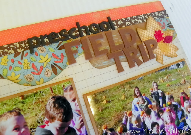
I wanted to share a quick post today to show you how I use the Kiwi Lane designer templates to create a layout. They have a great video on their site that outlines the whole process too - so be sure to watch that for more information.
I start by placing my photos on the background paper and moving them around until I find a look I like. They also have photo templates you can use for this. I use them when I have a lot of photos and I'm trying to see how many I can fit onto a layout. But when I just have a few, like on this page, I just use the photos themselves to figure out the placement.
Then, it's time to play around with the templates to find a look that works. I start with the borders, layering and stacking them. Then, I add in the shapes for accents. When it's done, it looks a little like this:
Next, I pull out the papers. This is a fun process because you can really go through your paper stash to find great combinations that work. I pull out papers that will work for the borders and then use scraps or full papers for the accents. I also find a paper to use for the photo mats.
Then, it's time to trace, cut, and ink. Again, the video on Kiwi Lane shows how to do this so well. For ink, I use Tim Holtz Distress Ink in Walnut Stain, which is a dark brown that I really like. It's one that I already had, so again, I'm using my stash. Love that.
Finally, you put all the pieces into place and adhere everything down. Add your title, journaling, and a date, and you're done.
I just can't say enough about the templates - they're fantastic. And nope, not getting paid to say that - just love them... :)


No comments:
Post a Comment